from TNW
Jerry Cao is a content strategist at UXPin — a wireframing and prototyping app with built-in usability testing — where he develops in-app and online content for the wireframing and prototyping platform. To learn how to conduct 20 different types of usability tests, check out The Guide to Usability Testing.
While most usability testing methods described in The Guide to Usability Testing apply to Web and mobile, we want to describe some of the nuances specific to each medium. Actually, most usability testing methods can be run any product from cloud payment systems to next-generation gaming consoles.
In this piece, we want to narrow our focus a little so you can best understand how the fundamental differences between how Web and mobile are used require different tactics.
Website usability testing
User tests are mandatory for website success since Murphy’s Laws of Technology always seem to strike at the worst times. While many of the usability testing methods can adapt for Web purposes, we thought it best to showcase a few pointers specific to website protocols and testing criteria.
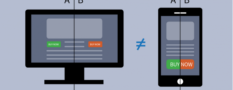
 Source: Template Monster
The principles for Web usability are the same as with other products, except they are even more important considering that there are over a billion websites as of September 2014.
The bottom line is that there are so many similar websites that visitors will simply move onto the next site if the first one they visit isn’t usable.
Procedure for running website usability tests
Damian Rees, Co-founder of Experience Solutions, helps explain how he adapted website usability testing for the most optimized experience. Because anyone can use the Internet, one of his core principles is setting criteria and expectations up front so that your tests proceed with the right level of technical proficiency.
Here are four tips to keep in mind:
1. Encourage users to behave naturally. Websites must support multiple modes of use and edge cases, and those might only surface when users feel comfortable.
By starting with open-ended tasks, you’ll get a sneak peek into how they use the Web outside of a testing environment. For example, if you’re testing an e-commerce site, first ask users to find a gift under $50, then get out of the way and observe them directly or remotely.
2. Let users complete the task how they want. If you feel your user has misunderstood the task or is going off track, just wait. The goal is to learn how a user interacts with your website, period.
In the real world, you won’t be there to reign them back in, so observe why they got sidetracked — those may be your best insights.
3. Test competitors or peer websites. Only testing your own site robs you of context. Including other websites will help you see “the forests and the trees.”
Try asking the participant to show you a site they use on their own, and have them show you how they use it. It’s not just about how users interact with your website — it’s about tailoring your website based on how they use the Web.
4. Hide which site you’re testing. Users tend to be less honest when they know they’re talking to an employee of the company under scrutiny. Do your best to not reveal you’re testing your site.
The user may figure it out by the end of the session, but the longer you delay it, the more accurate your first impressions. Try asking them to assess competitor or peer websites first — this puts them in the right critical mindset.
As a guiding principle, try not being too rigid. Keeping an open mind and a loose attitude will put your test-taker at ease and yield better, more natural results.
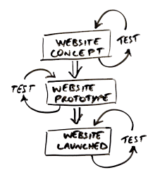
 Source: Don’t Guess, Test
Criteria for running website usability tests
When conducting a usability test for a website, there are specific criteria you should check for that might not be relevant to other products. Jacob Gube, founder of Six Revisions, believes that qualitative feedback alone is not enough for websites — especially considering how simple technical tweaks to things like site speed can drastically affect the experience.
As explained in The Guide to Usability Testing, there are six criteria that must be tested for all websites, whether it’s a personal blog or a corporate site:
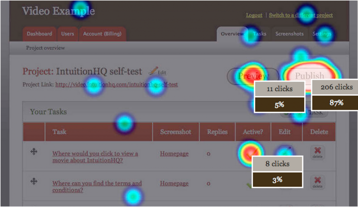
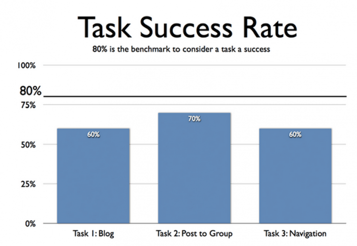
1. Task Success — One of the most important measures of usability is how easily a user can complete a target task, such as finding an older post or creating an account. You’ll want to examine learnability, intuitiveness, efficiency, recovery from errors, and memorability for future use.
You can assign direct and open tasks to analyze the task success rate, then follow up with the single ease question.
 Source: User-Centered Design
2. Navigability — Site search is never a crutch for bad navigation. Do you have enough site features (like calls to action, links, etc.)? How fast and in how many clicks does it take users to get where they want? Card sorting and tree testing are perfect for answering these questions.
3. UX Design — User satisfaction can get lost in the mix when focusing on more quantitative factors, but it’s just as important (if not more).
Interviews, field studies, diary studies, and the tests listed in the previous hybrid chapter all get feedback on the user’s emotional responses. Remember: being usable isn’t enough, aim to be delightful.
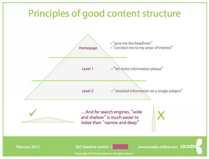
4. Readability — As discussed in Web UI Best Practices, content is the heart of any website. Pay attention to your site’s legibility, comprehension, language, and the enjoyability of the content. Read-Able, WordsCount, and CheckMyColours are great usability tools for assessing your site’s readability.
 Source: Organizing Content for Readability
5. Accessibility — Is your site experience consistent across every major browser? Is your HTML compatible for various assistance tools for users with disabilities? Here’s a great list of accessibility testing tools to show you how accessible your site is.
6. Speed — No one likes to wait. A website’s speed will impact the UX, functionality, and even SEO performance. Check your file sizes and code quality to reduce unnecessary lag. Follow these best practices, then test your site speed with a tool like Pingdom or Google PageSpeed
With a few simple tweaks, you can adapt any of the previous usability tests to better analyze the usability of a website. Find out where your site’s lacking, then view the tests through the sharp lens of Web usability.
To see a live example of different ways of evaluating some of these criteria, check out the e-book User Testing & Design.
Next: Onto mobile usability tests
Mobile usability testing
Mobile devices may seem to exist in another world compared to websites and computer software — gesture controls, specialized screens, and device compatibility are all factors unique to mobile devices. So when it comes to testing your app or website for mobile usability, it’s important to know what you’re getting into.
We’ll provide some tips that usability professionals learned after years of experience, then show how these can be applied.
 Source: Blink UX
Advice for adapting to mobile usability
Designing for mobile is different than designing for the Web, and those same subtleties apply to usability testing. Dr. David Travis, Founder of UserFocus, believes the fundamentals of usability testing still apply — provided you make a couple important tweaks.
There are a few important changes to keep in mind:
- Recruiting participants — For mobile devices, your participants must be regular users of the testing platform. For example, don’t hire iPhone users if you’re testing an Android app. The user will be confused about the new platform’s UI conventions, biasing the test. Make sure users have spent at least three months on their device.
- Cater to user customization — People customize their settings for mobile devices far more than computers or other products. Asking them to use settings outside of their comfort zone may bias responses. The way to sidestep this is to get your app on their customized phone. You could export a prototype as a clickable PDF, use POP (Prototyping on Paper) for iPhones, use toolkits with app-simulating widgets, or an all-fidelity prototyping app like our UXPin.
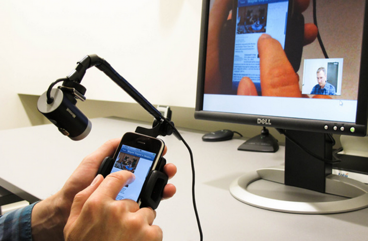
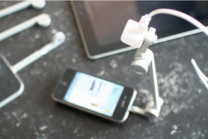
- Testing apparatuses — Mirroring the test-taker’s screen is always harder for mobile devices than PC. For iPhones, you can use Airplay to link the device to a TV screen, but other devices might require special cords and jacks. The standard solution is a small, craned camera like Mr. Tappy that films the screen and the finger movement, although the view and the quality are not as good as a direct connection. Make sure you prepare your tools before the test — nobody wants you staring over their shoulder.
 Source: Mr. Tappy, via Actual Insights
Jeff Sauro, Founder of MeasuringU, adds some tips of his own that are exclusive to mobile usability testing. If you are new to mobile testing, pay attention — Sauro is a usability veteran, and his experience will save you time and possibly embarrassment.
1. Have chargers ready — This really isn’t an issue with desktop tests, but nothing ends a mobile usability test faster than a dead battery.
2. Encourage users to pick up their phone — It’s true that some people prefer using mobile devices on a stationary surface, but there’s always a chance they’re just doing it due to the testing environment.
3. Record fingers, screens, and bodies — Unlike stationary desktop users, mobile devices involve three dimensions of data. Pay attention to how the participant uses gesture controls, mistakes and successes altogether.
While recording the body isn’t necessary, capturing facial expressions and body language provides insight into the user’s emotional state.
4. Test on different platforms — Related to the tip about recruiting participants who use your mobile platform, if you’re testing an app (or website) designed across multiple platforms, test each one separately. A great experience on an iPhone may not port over perfectly to the Android version.
While mobile testing used to be only done in a lab setting, unmoderated remote testing (which we mentioned before) has also adapted quite well to the mobile space. While you won’t be able to record fingers and body movements, tools like UserZoom and UserTesting make it easier to recruit users based on very specific usage criteria and can quickly gather much larger sample sizes.
If you’d like to conduct remote mobile testing on your own, you can follow the process used by MailChimp to test seven people in two days.
1-hour mobile usability testing
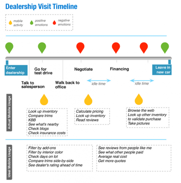
While these tips can help adapt any of the previously mentioned usability tests for mobile context, Marina Lin, Mobile Interaction Designer at Cars.com, relates her own personal participatory design test that she uses to test the Cars.com app.
While the procedure may seem familiar at this point, it’s the alteration to suit mobile devices that you should be aware of.
 Source: Applying Participatory Design to Mobile Usability Testing
1. Immersion and Awareness (10-15 minutes) — Get users to focus on the context of using the site or app. What tasks do they hope to accomplish, and is their usage based on needs or timing?
Lin first asked broad questions about the length of the car search and what cars had been test driven. Then, she focused on their visit to the dealership to buy a car.
Finally, she asked for them to rate their satisfaction with the process and mobile use.
2. Documentation (20 minutes) — Next, she asks users to document on a timeline the experience of completing the task, not just using the app. It’s helpful to establish parameters to keep them on track — perhaps have them fill out a worksheet based on the sample below.
In addition to app usage, also note any positive or negative emotions. After multiple sessions, you’ll see trends emerge.
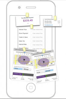 3. Create a Feature (20 minutes) — With the app experience fresh in the test-taker’s mind, hand them drawing utensils and ask them to design a feature they think would help.
Again, it’s best to set parameters, maybe with previously made cards with feature attributes, stencils, shape cutouts, or another worksheet. Refer back to the timeline and ask them when their original features would apply.
4. Wrap-up (5-10 minutes) — Close the session with one last round of feedback. If one of their features interested you, ask them to elaborate; or perhaps ask their opinion on user-designed features from previous sessions.
Some feedback on the testing process for improvements on future sessions might also be useful.
A test such as this one retains all the benefits of the participatory design tests discussed in The Guide to Usability Testing while requiring relatively little time.
By following the advice we’ve provided and throwing some participatory design into the mix, you might even find that mobile usability testing is just as easy as testing for the Web.
Takeaway
Web usability and mobile usability may be under the single umbrella of usability, but the approaches can seem like night and day when you think about all the subtleties. When planning your goals, keep in mind the usability functions special to whichever one you’re designing for, its distinct functionality criteria, and the tests best used to study it.
Now it’s time to get started. Take your time at each step of the way and don’t proceed if you don’t understand something. To help standardize the process, feel free to check out this free usability testing kit. As you’re testing, remember to always focus on your goals. Because if you don’t know why you’re testing, then the methods are irrelevant.
For explanations and practical tips for 30 different types of usability tests, check out free 109-page Guide to Usability Testing. Best practices are included from companies like Apple, Buffer, DirecTV, and others.
